TradeSource by PGC
TradeSource by PGC
About
About
TradeSource is a project by PGC that uses blockchain as a means of agricultural trade where you mint NFTs based on you trade details. My job was to design the landing page and the marketplace for their project. Later on I had to prototype the marketplace.
TradeSource is a project by PGC that uses blockchain as a means of agricultural trade where you mint NFTs based on you trade details. My job was to design the landing page and the marketplace for their project. Later on I had to prototype the marketplace.
Team
Team
1 Designer
1 Front-end Developers
1 Designer
1 Front-end Dev
1 Designer
1 Front-end Dev
My Role
My Role
UI/UX Design
Graphic Design
Information Architecture
UI/UX Design
Graphic Design
Info Architecture
UI/UX Design
Graphic Design
Info Architecture
Tools
Tools
Figma
Photoshop
Illustrator
Figma
Photoshop
Illustrator
Landing Page
First thing we had to do was design the landing page for the website that was based on a project presentation. They insisted on having a lot of textual content and mimicking some parts of the slide decks which was maybe too much for a simple landing page, but I managed to make it good design-wise. Also they insisted on heaving similar visual tinges as their partner Juneo Supernet.
First thing we had to do was design the landing page for the website that was based on a project presentation. They insisted on having a lot of textual content and mimicking some parts of the slide decks which was maybe too much for a simple landing page, but I managed to make it good design-wise. Also they insisted on heaving similar visual tinges as their partner Juneo Supernet.

Hero Section for the landing page. Designed fo 1920px screen width.
*The website may have underwent some changes since the original design.
Marketplace
TradeSource Marketplace is a platform where users can trade delivery bills for shipping of goods in the form of Non-Fungible Tokens. They use a blockchain as a means of trading rice and fertilize shipping. The users can basically do 2 main things:
Sell - where they go through a flow giving out shipping information that in the end makes a NFT which they have in there dashboard and they can sell it.
Buy - where they go on the page tha show available shipping NFTs waiting to be bough.
TradeSource Marketplace is a platform where users can trade delivery bills for shipping of goods in the form of Non-Fungible Tokens. They use a blockchain as a means of trading rice and fertilize shipping. The users can basically do 2 main things:
Sell - where they go through a flow giving out shipping information that in the end makes a NFT which they have in there dashboard and they can sell it.
Buy - where they go on the page tha show available shipping NFTs waiting to be bough.

Banner for the marketplace.
Part No 1
User Flow
First things first, I needed to draw out a task flow that kind of ended up being a user flow, because, although it was a presentational website, it needed to seem fully functional. It had 2 main directions after the crypto wallet is connected: Sell or Buy.
First things first, I needed to draw out a task flow that kind of ended up being a user flow, because, although it was a presentational website, it needed to seem fully functional. It had 2 main directions after the crypto wallet is connected: Sell or Buy.
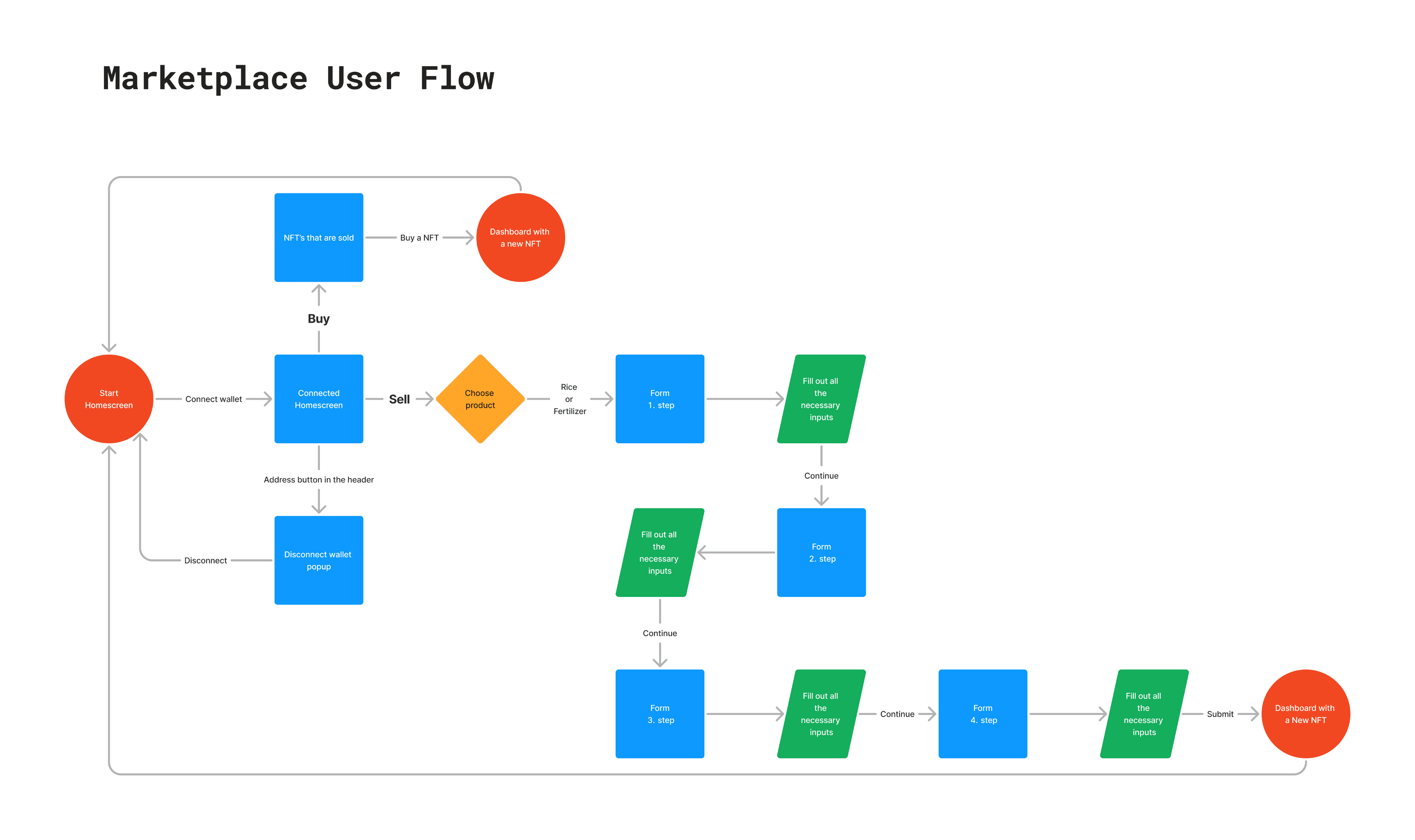
First draft of the user flow.
Part No 2
Wireframes
First I sketched out a low-fidelity wireframe of the screens I determined I needed, plus I drawn out how the NFT should approximately have it’s info displayed. I also wrote down all the high priority demands from the owner of the company, so that I can keep track in the early stages what needs to be integrated later. After I finished all the main layouts, I made in Figma a somewhat high-fidelity wireframe flow, since I had almost all the information except some paragraphs, headers and images.
First I sketched out a low-fidelity wireframe of the screens I determined I needed, plus I drawn out how the NFT should approximately have it’s info displayed. I also wrote down all the high priority demands from the owner of the company, so that I can keep track in the early stages what needs to be integrated later. After I finished all the main layouts, I made in Figma a somewhat high-fidelity wireframe flow, since I had almost all the information except some paragraphs, headers and images.

Low-fidelity wireframe, NFT card and design demands.

Part of the high-fidelity wireframe, full view in the Figma link below.
Step No 3
Hero Section Design
A hero section is something not be taken lightly. From the user’s side it is the entryway and the beginning of there journey through the platform. From the the client’s view, it sets the direction of his appreciation of the work you’ve done. Having the client’s demands in mind, I made the desired layout all together with some of my, a bit differing, but aesthetically pleasing solutions.
A hero section is something not be taken lightly. From the user’s side it is the entryway and the beginning of there journey through the platform. From the the client’s view, it sets the direction of his appreciation of the work you’ve done. Having the client’s demands in mind, I made the desired layout all together with some of my, a bit differing, but aesthetically pleasing solutions.

Just a couple of many designs suggestions.
Client’s Demands
White background for overall website
Dark header
That particular image of a container ship
Final Hero Section Design

Hero section.
Step No 4
Final Platform Design
The rest of the design was fairly straight forward with the wireframe and the user flow being locked in. I used the colors from the logo and the typography from the landing page. Also added some colors resembling the different nuances of the containers on a ship. It can be also seen that there are two primary buttons: pink for ‘Buy’ and blue for ‘Sell’, to differentiate them. I tried not to overcomplicate the pages so that it can be fairly quickly developed, because we were on a deadline.
The rest of the design was fairly straight forward with the wireframe and the user flow being locked in. I used the colors from the logo and the typography from the landing page. Also added some colors resembling the different nuances of the containers on a ship. It can be also seen that there are two primary buttons: pink for ‘Buy’ and blue for ‘Sell’, to differentiate them. I tried not to overcomplicate the pages so that it can be fairly quickly developed, because we were on a deadline.

Device mockup, made with the help of AI.
NFTs
NFT cards represent the shipping bill that’s stored on the blockchain. Every NFT is unique for itself and can be traded on the marketplace. The design is a early test version because the information and the metadata is yet to be affirmed.
NFT cards represent the shipping bill that’s stored on the blockchain. Every NFT is unique for itself and can be traded on the marketplace. The design is a early test version because the information and the metadata is yet to be affirmed.

NFT cards banner.
Problem No 5
Prototype
Midway through the development the project took a major turn. In order to give out the final demo of the marketplace, the coding was aborted. Instead I was entrusted to prototype in Figma, so it can be presented right away. I was asked to only do 2 versions: desktop and mobile. The only thing was if the desktop version is another screen then the one being design for I needed to find a solution for the demo user.
Midway through the development the project took a major turn. In order to give out the final demo of the marketplace, the coding was aborted. Instead I was entrusted to prototype in Figma, so it can be presented right away. I was asked to only do 2 versions: desktop and mobile. The only thing was if the desktop version is another screen then the one being design for I needed to find a solution for the demo user.
Solution
The mobile was not a problem because when presenting a design on that device it adjusts to it’s screen automatically, but that doesn’t apply to the desktop device. So I made a screen before the first screen with a popup that explains how to adjust the screen. I instruct the user to press the “Fit width” option in the prototype settings, because at the time there was no “Responsive” option.
The mobile was not a problem because when presenting a design on that device it adjusts to it’s screen automatically, but that doesn’t apply to the desktop device. So I made a screen before the first screen with a popup that explains how to adjust the screen. I instruct the user to press the “Fit width” option in the prototype settings, because at the time there was no “Responsive” option.

Initial popup with a gif and instructions.

User flow of the demo.
Recap
Adaptability
Knowing where to you place yourself within the needs of the stakeholders, users, or the process itself is crucial, not just for the product you are building, but for yourself as a designer ot innovator. The moment the task changes either you adapt or you fall behind.
Flexibility is key.
If it doesn’t work one way, be ready to switch things up.
Knowing where to you place yourself within the needs of the stakeholders, users, or the process itself is crucial, not just for the product you are building, but for yourself as a designer ot innovator. The moment the task changes either you adapt or you fall behind.
Flexibility is key.
If it doesn’t work one way, be ready to switch things up.
Back to Top
© 2024 Aleksa Majstorovic A420. All Rights Reserved.
© 2024 Aleksa Majstorovic A420.
All Rights Reserved.
© 2024 Aleksa Majstorovic A420. All Rights Reserved.